Color is often your first impression of a room, and it is usually the impression that lasts the longest. Its impact can overshadow the shape, texture, and arrangement of objects, and can actually make fixtures and even whole rooms appear to change size. Because a bath room contains a variety of very different components—wall and floor surfaces, fixtures, furnishings, and accessories—the range of effects you can create with color is virtually limitless.
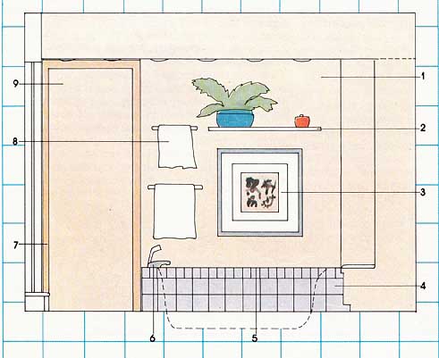
South wall:
1. Light apricot for all major vertical surfaces.
2. White shelf.
3. Oriental print with thin slate frame and wide white matte.
4. Light gray tiles with slate gray grout.
5. White tubs
6. Chrome and white ceramic fittings.
7. Slightly darker shade of apricot for trim and molding.
8. White towels and towel bars.
9. Door painted in same light apricot used on walls.
Warm and cool colors. Colors may be seen as cool or warm. Those closest to blue tend to feel cool; those closest to red tend to feel warm. A cool color appears to make surfaces and objects recede, and warm colors appear to make surfaces and objects advance. As a result, a cool-colored room may seem larger than it is and a warm-colored room may seem smaller. The feel of colors in the middle ranges depends largely on how much blue or yellow they contain. Blues and greens with a lot of yellow can appear warm, and reds or yellows with a great deal of blue in them will seem cooler. Even whites, grays, browns, and blacks can appear either cool or warm depending on the amount of yellow or blue they contain. If you know that you want a warm, cozy bathroom, you can use this basic principle to guide your choice of basic color families, Colors chosen from within the same family tend to produce a soothing effect, whereas combining colors from the opposite sides of the color wheel—red/green, blue/orange, yellow/purple—tend to make a strong impression.
Color schemes. Selecting basic color families is a very personal choice. You don’t have to know why you like certain colors—if you like them, use them. But use them well. Start by choosing a color scheme—you can begin with your fixtures or any other element and build from there. If you consider your floor material as a base, other horizontal planes tend to look best when they’re the same or in a close family. Fixtures (basins, tubs, and toilets) can provide contrast. Most color schemes fall into one of three categories:
In the monochromatic scheme, a single color in varying degrees of tone and value is used for all major surfaces and fixtures. The effect can be one of peace and security. Accessories are chosen in related or complementary accent colors.
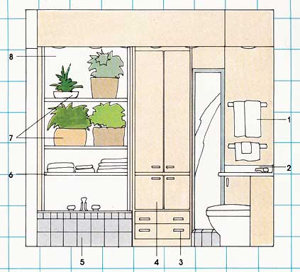
West Wall
1 White towels.
2 White counter top.
3 White drawer pulls.
4 Storage unit. In same light apricot used on walls.
5 Light gray tile with slate gray grout encloses tub sides and ledge.
6 White shelves.
7 White and apricot pottery plus natural baskets to hold plants.
8 White wall behind shelves.
In the complementary scheme, contrasting colors are used on major surfaces and for fixtures. Properly realized, this scheme produces excitement and vivacity; but if it gets out of hand, which it frequently does, a sort of manic confusion can result. For the person who wants to employ a complementary color scheme but feels uncertain about the way to achieve a pleasing result, a reasonably safe solution is to choose one dominant color for major areas like walls, floors, and ceilings, and one sup porting color for trim, woodwork, and accents.
The related color scheme is created by using colors connected by a common base. Yellow might be used with yellow-green and green, or with yellow-orange and orange. Accessories in different hues of the related colors can blend or provide contrast.
Color and space. These two elements work together. If you’re trying to make a large bathroom look smaller, you can use more intense colors. Conversely, you can make a small room look larger by using more diffuse and softer colors. Or you can make a large room look even bigger or a small room even cozier. Either way, you can consciously use this principle of light and space to create the desired effect. You can also make your bathroom seem to change shape: Darker floors and vertical surfaces coupled with a light ceiling make it seem taller. A dark ceiling with light walls, cabinets, and floors will make it seem wider and lower. Darker colors at the end of the room will shorten its visual length. There is a limit to what you can do with this principle, but it can guide some of your choices.
Color and light. Any color will look different in bright sunshine and under fluorescent tubes. When selecting paint, fixtures, or flooring, choose your colors by examining them in your own bathroom. You may be in for a big surprise when something you were sure was green looks blue, or when something you knew was red looks orange. Examining a color in your own home will save you a lot of disappointments. Try not to order a colored fixture from a catalog. The way in which the photo graphed piece was lit, the quality of the printing, and the conditions under which you are viewing the picture, can all combine to give you an erroneous sense of the true color, Instead, once you have decided on a color, see the fixture itself or another of the same color.
Next: Light, Pattern and Texture
Prev.: Line, Scale, & Shape